2 minutes
Bicing Visualizations
The aim of this project was to develop two sets of insightful visualizations for the Bicing Data, Barcelona bike sharing service, to compare performance characteristics of differne stations and kinds of bikes (mechanical and electric). Both groups of visualizations were developed with Python’s library Altair.
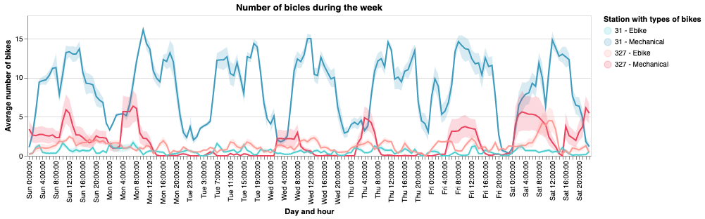
The first visualization consisted of a static infographic, comparing the usage of two docking stations during January 2020. The infographic was designed to show the performance differences of two stations with opposite characteristics.
The two compared stations where Station 31, at sea level and Station 327 at the mountain.
At mountain level stations there’s high demand of bikes, because all the routes are downhill. However, at sea level many people arrive with bike, but there’s not a high demand for bikes. This causes during peak hours a deficit of bikes in mountain stations and a deficit of free docking space at sea level stations.
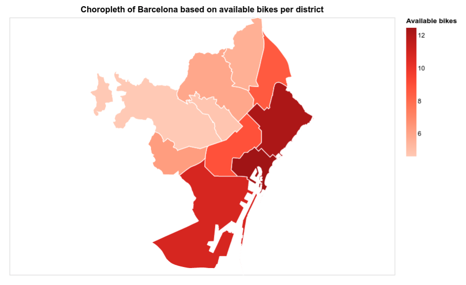
The second visualization is a set of interactive plots, showing the performance of all Barcelona stations during January 2020. The aim of this more complex visualization was on one hand to show an “overview” of the whole Bicing service and on the other hand to allow the user access specific information under request.
With the use of Altair interactive capabilities, more information can be shown in an intuitive way, making it easier for the user to understand the data and find meaningful relations.
This project was developed in the context of VI -GCED class, as a way to implement both theoretical and practical knowledge learnt during the course. All the visualizations were designed with a strong focus on technical quality principles such as Schneiderman’s mantra and the laws of perception.
Both visualizations are implemented in Collab ipynb notebooks. In the notebooks all the design process, decisions and final result are detailed (in Catalan). It can all be found in this repository.